A streamlined shopping experience for modern users.
Overview
Dexter is an online retail platform offering clothing and accessories. We redesigned the UX/UI to create a seamless, intuitive shopping experience, from discovery to checkout.
Client
Dexter Inc.
Role
Product Designer
Location
New York / Remote
Challenges
The platform’s navigation was fragmented, with inconsistent visuals and confusing flows that reduced usability and trust.
Approach
I conducted user research, mapped journeys, and created information architecture for clear shopping flows. Low-fidelity wireframes validated structure and navigation. A unified design system standardized components and visuals. High-fidelity UI and interactive prototypes were iterated through usability testing. Developers were closely involved to ensure smooth implementation.
UX Discovery
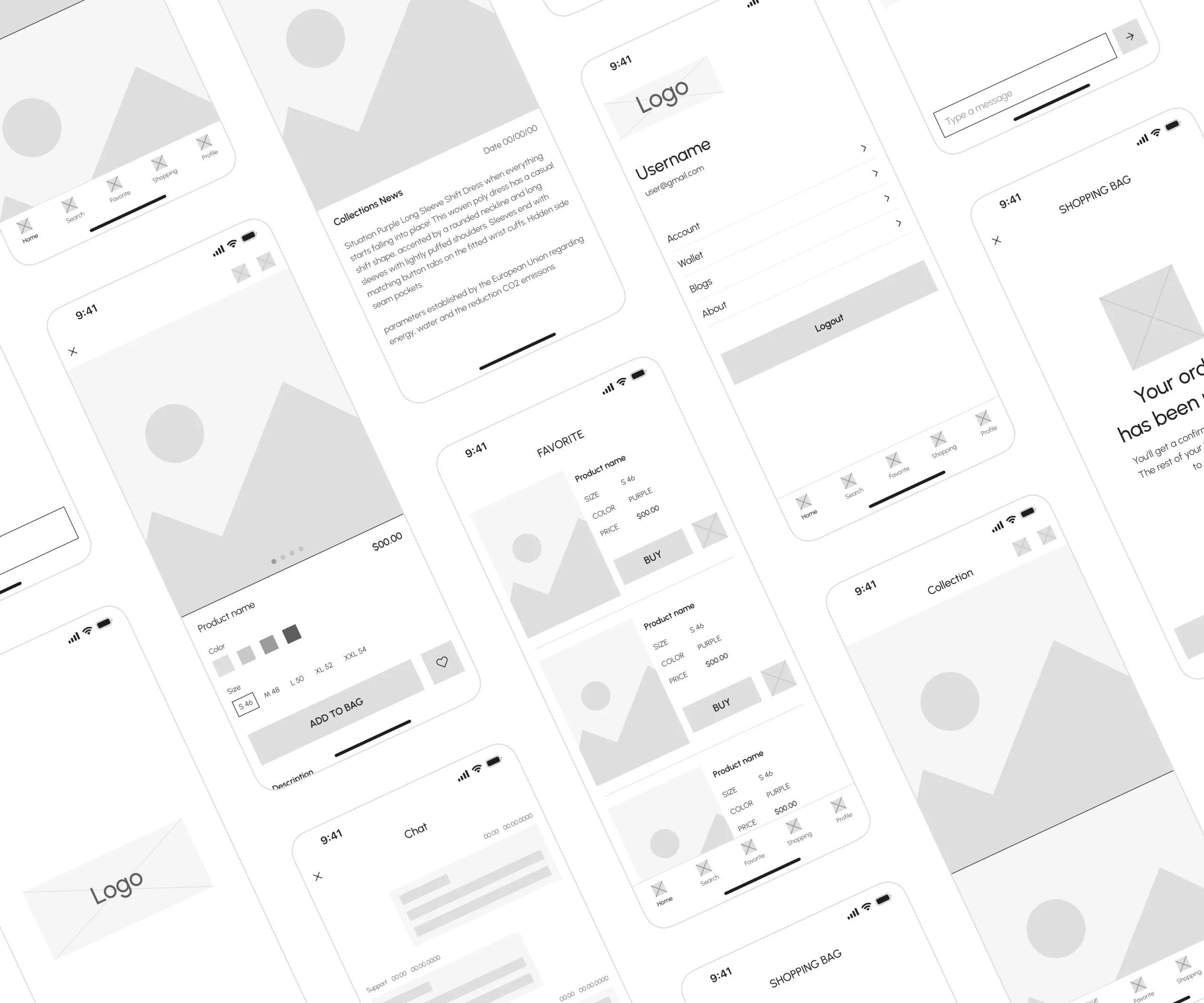
I mapped the end-to-end user journey to understand needs, behaviors, and pain points, translating insights into clear user flows that guide every interaction within the product. Low-fidelity wireframes and prototypes were created to visualize structure, layout, and interaction patterns, allowing rapid iteration and validation before moving into high-fidelity design. The process ensures that the product is intuitive, efficient, and aligned with real user expectations.
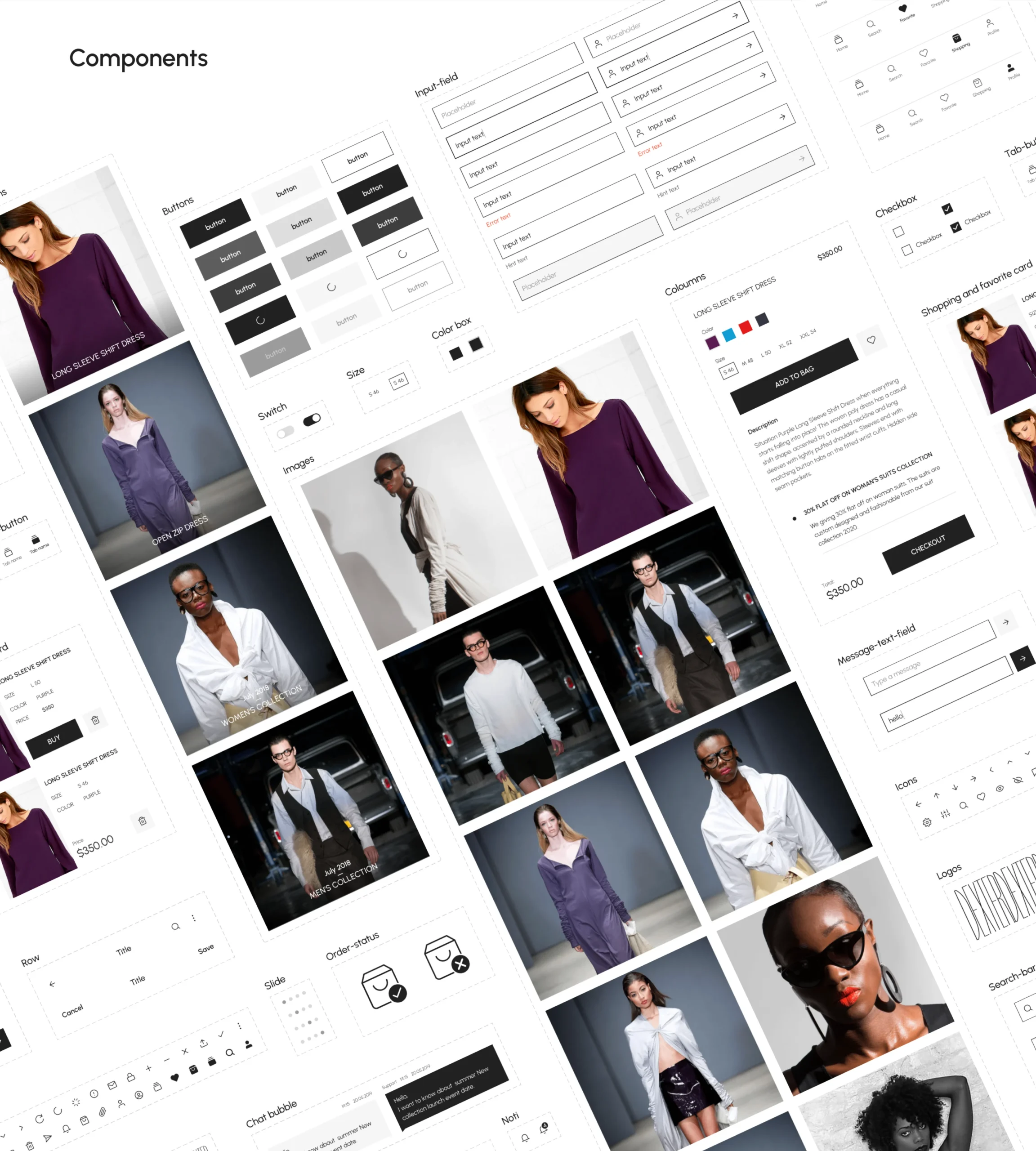
Design system
Developed a modular design system covering typography, colors, spacing, icons, and reusable components—ensuring a consistent experience and faster development cycles.
Final Experience
Dexter now offers a clear, consistent shopping experience that reduces friction, improves usability, and builds trust with users.
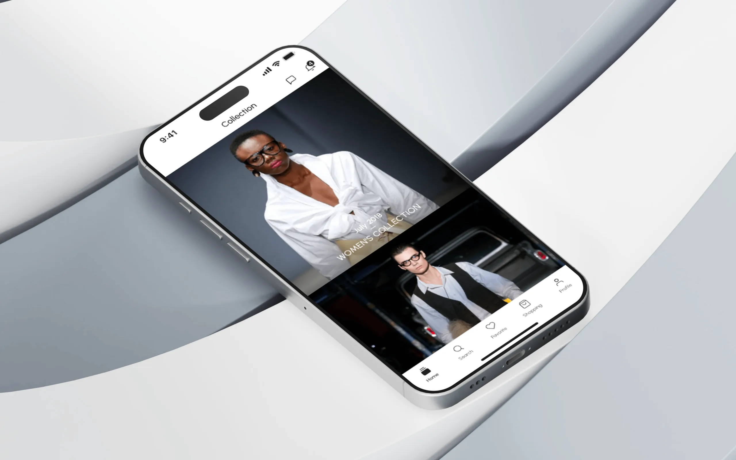
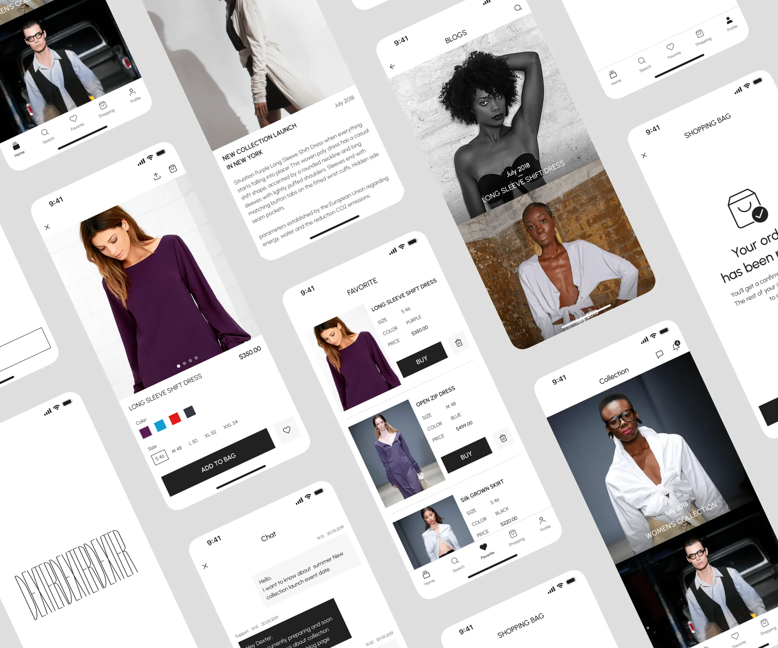
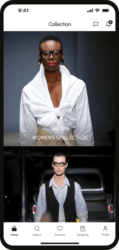
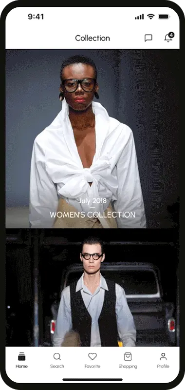
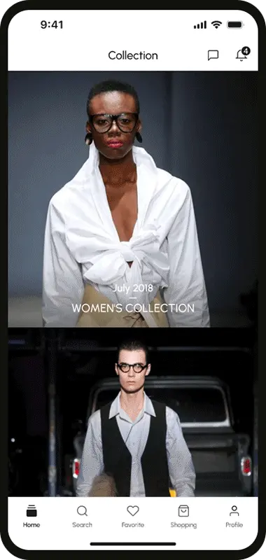
Product Collection
Product view
and details
Shopping bag & Favorite
News feed
Chat & Notification
Final Thoughts
The design of Dexter platform is user-centered and visually cohesive, balancing functionality and simplicity to enhance shopping, engagement, and retention.